
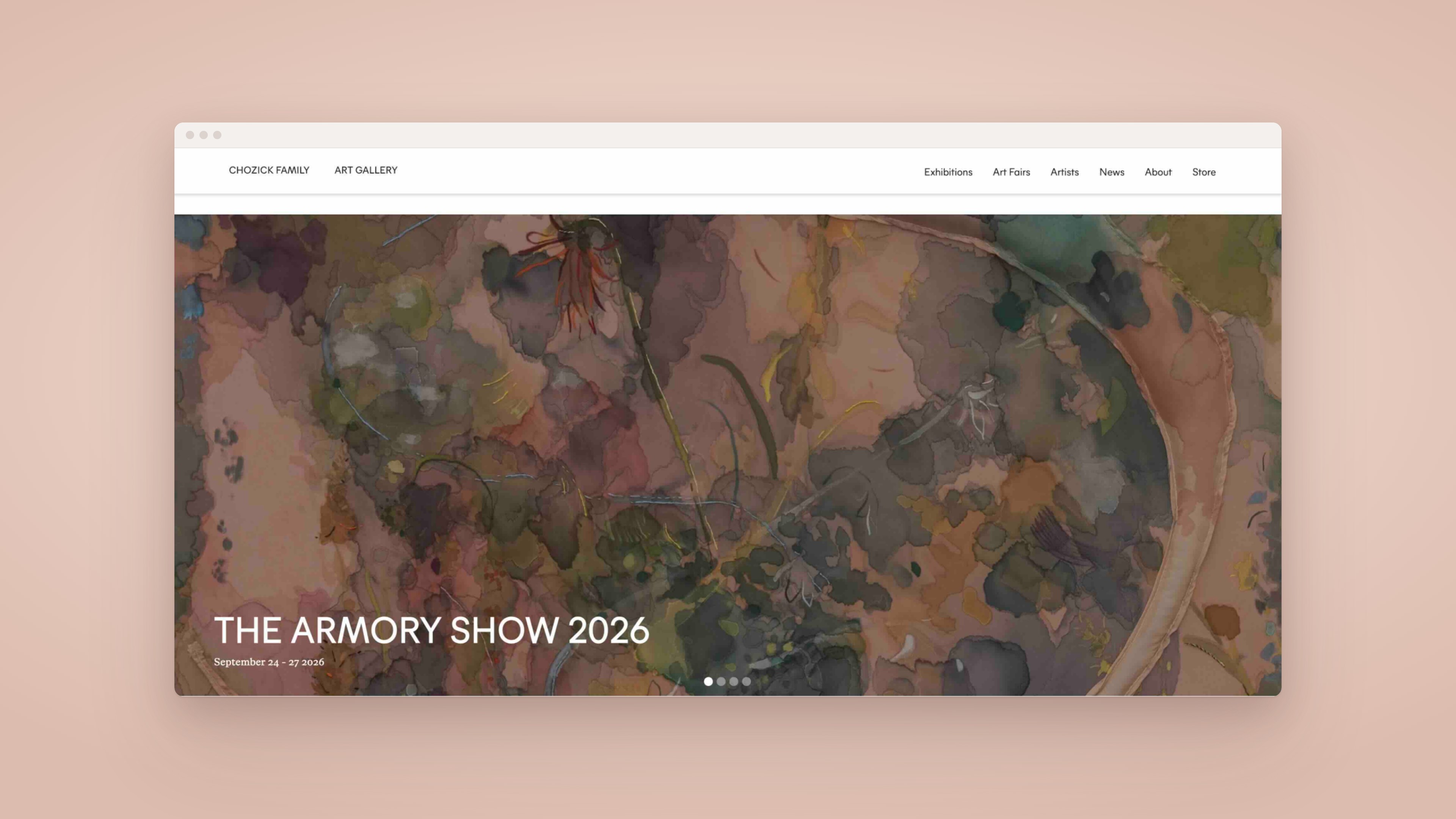
I led the UX strategy, visual design, and Webflow development for Chozick Family Art Gallery from start to finish. It was a brand new gallery with no existing website, brand system, or content to build from. Because the collection of artists, artworks, and exhibitions would constantly change, I designed the entire site around a scalable CMS architecture from day one. The site is now live, ranks highly in Google search, and has been well received by both the gallery and its exhibiting artists.
Chozick Family Art Gallery
Oct – Dec 2024 · ongoing CMS management
UX Strategist, Visual Designer & Webflow Developer
How might we design and build a brand new gallery website that scales effortlessly as the gallery's artists, artwork, and exhibitions are constantly changing?
Chozick Family Art Gallery was starting from zero, with no existing site, no established brand system, and nothing to migrate. Unlike a redesign, every foundational decision had to anticipate a gallery that would be perpetually onboarding new artists and swapping exhibitions, without ever needing a rebuild.
I mapped the site before designing a single screen. The first sitemap had five sections; the shipped site has seven, after Art Fairs and a Store were added. Every section that changes often runs on the CMS.
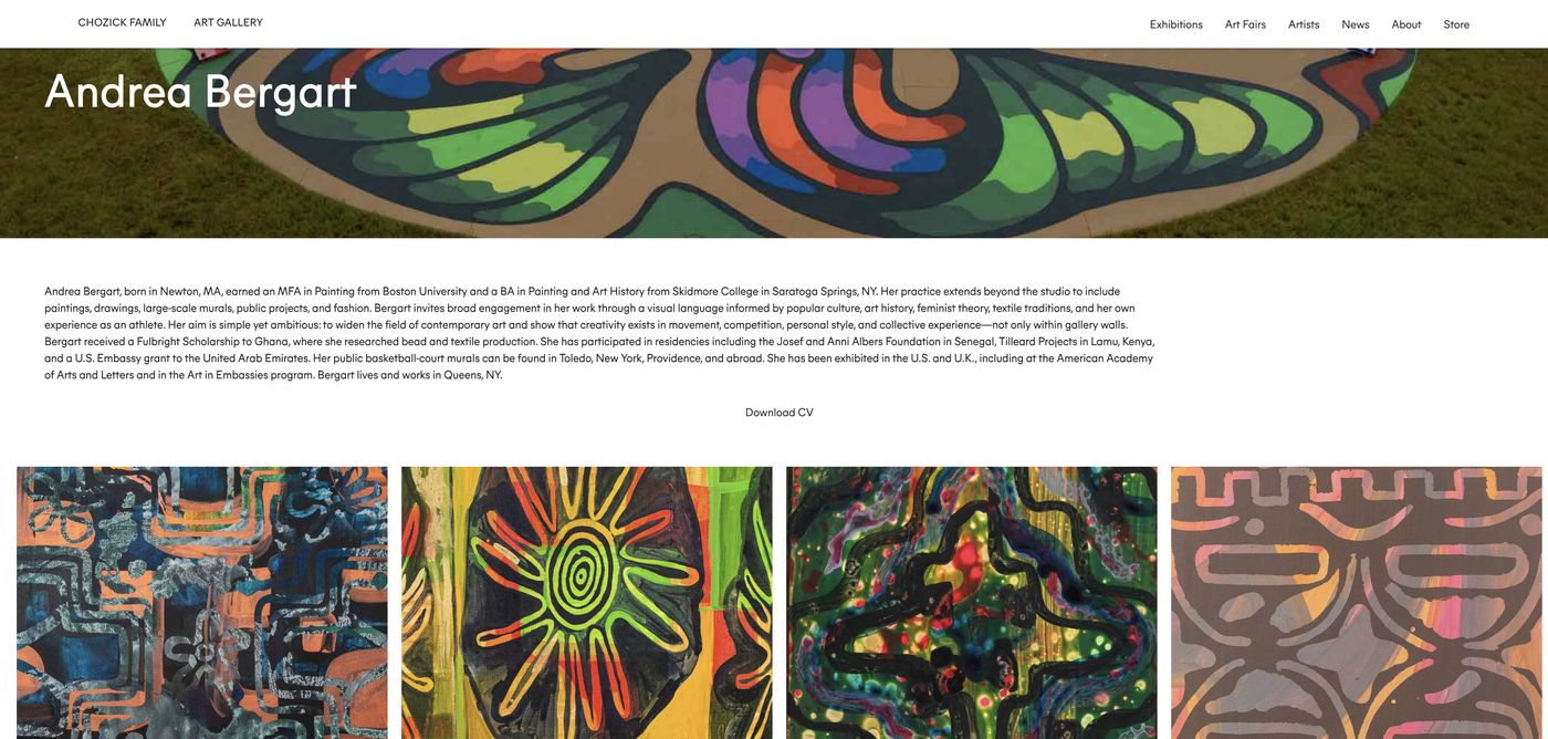
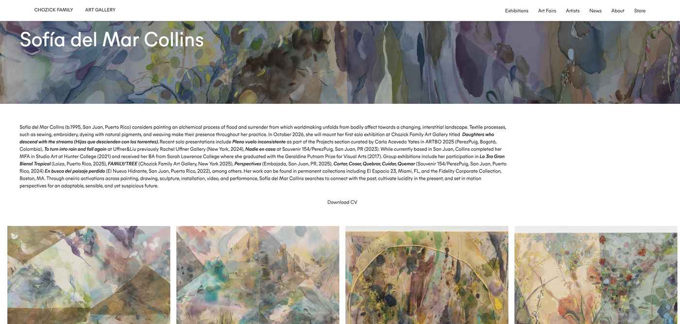
With no existing brand to inherit, I built a visual system whose main job was to stay out of the way. The gallery's artists work in very different registers, from Andrea Bergart's saturated murals to Sofía del Mar Collins's soft watercolors on silk, so the interface had to frame all of it without competing with any of it. I kept the palette to black and white, with no accent color, and let the artwork supply all of the color.
Two typefaces, six roles. Miera carries everything structural; ABC Otto is reserved for dates.

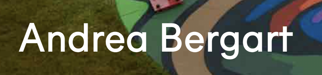
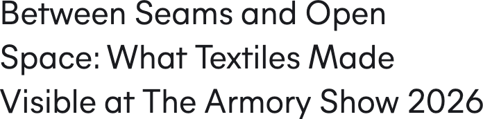






Because every page is assembled from this small set of styles and CMS templates, each new artist, exhibition or news item inherits the system automatically, with no design decisions left for the gallery to make.
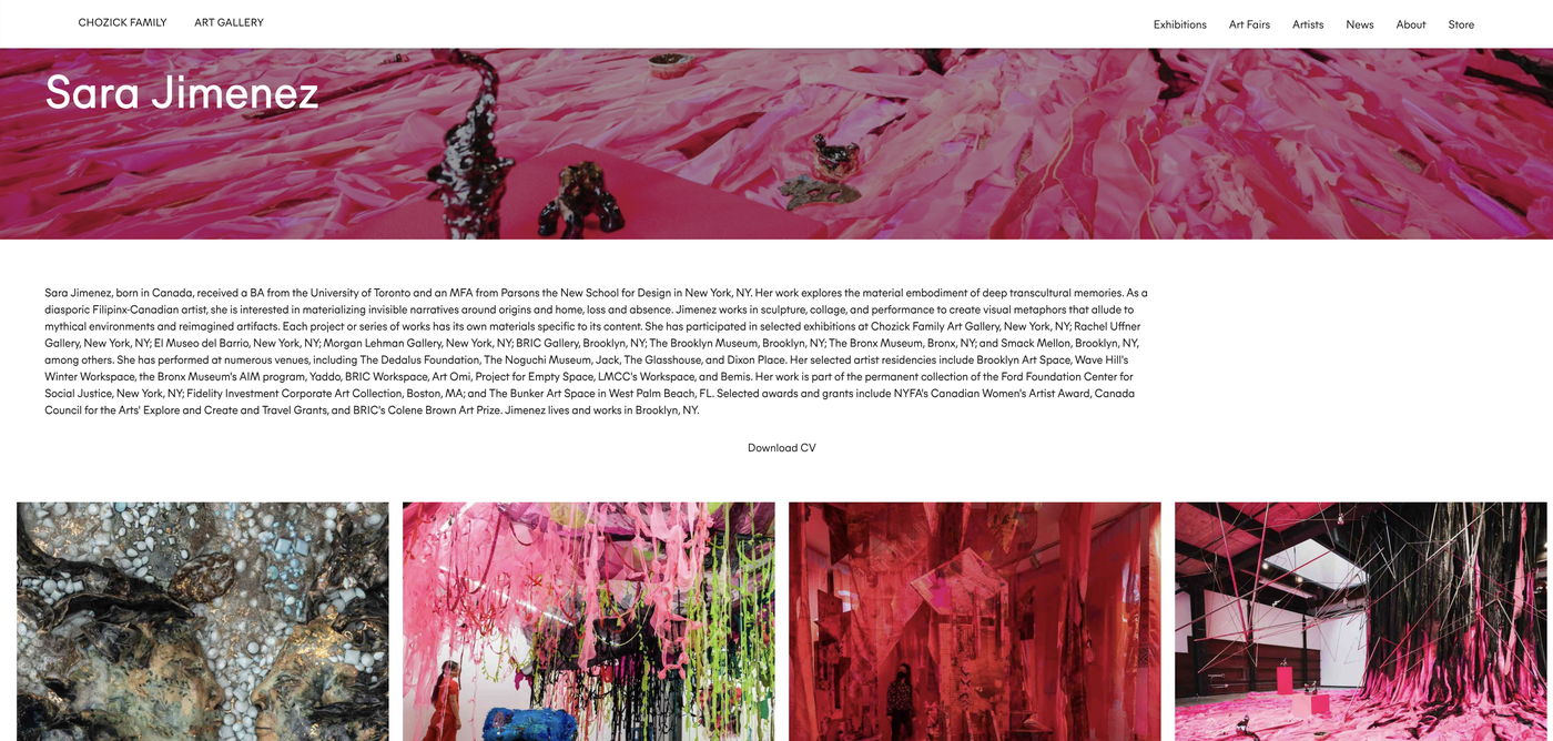
Rather than designing a separate page for each artist, I built a CMS collection and page template so any artist, current or future, could be added to the site without touching the design or code. This meant the gallery could grow its roster indefinitely without ever coming back to a designer or developer for a new page.
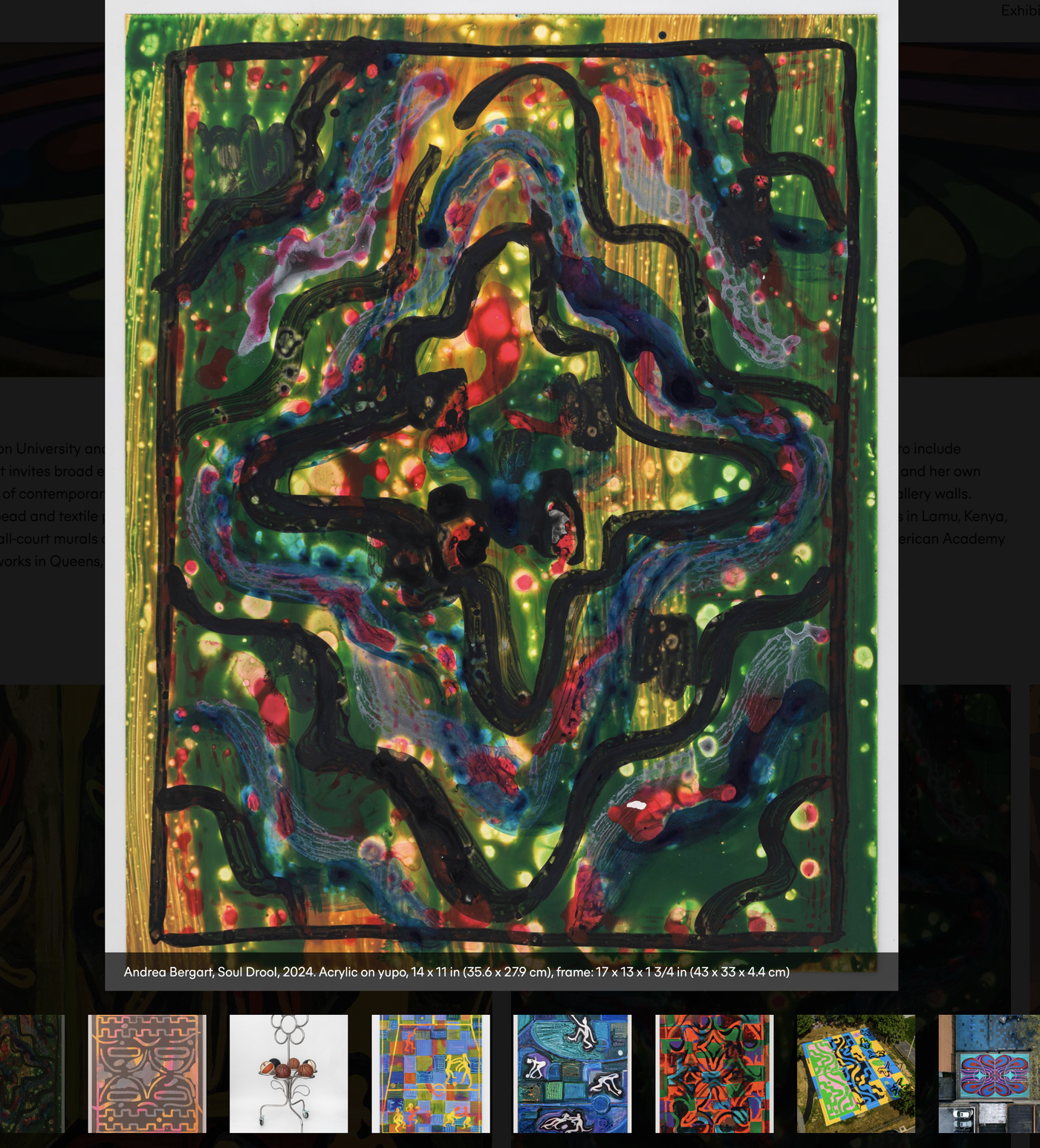
To let visitors study individual pieces without leaving the browsing flow, I custom coded a lightbox: click any work to open it large, with the artist, title, medium and dimensions in a caption bar, then move through the rest of the series with the arrows or the thumbnail strip.
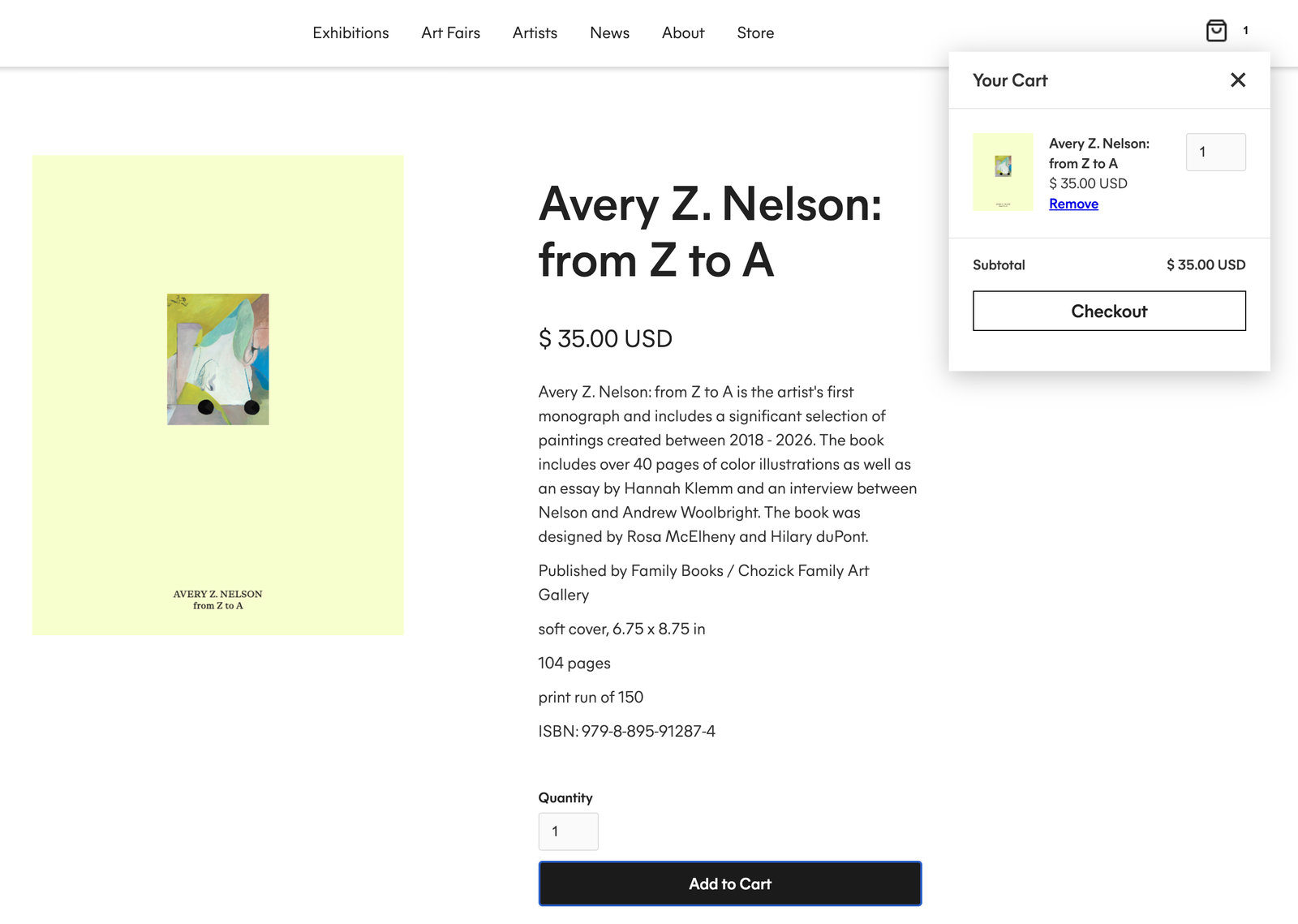
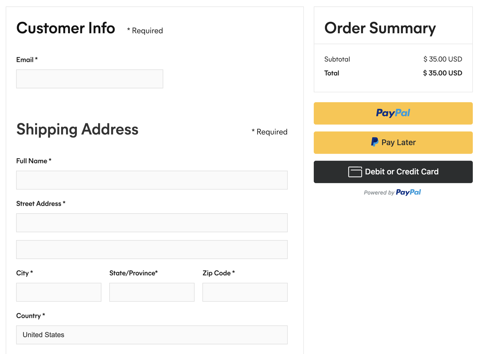
I designed and built the gallery's store end to end: a CMS-driven product page template for publications and artist merchandise, the cart, and a customized checkout experience. Every step uses the same type and color system as the rest of the site, so buying a monograph feels like part of visiting the gallery rather than a detour to a separate shop.
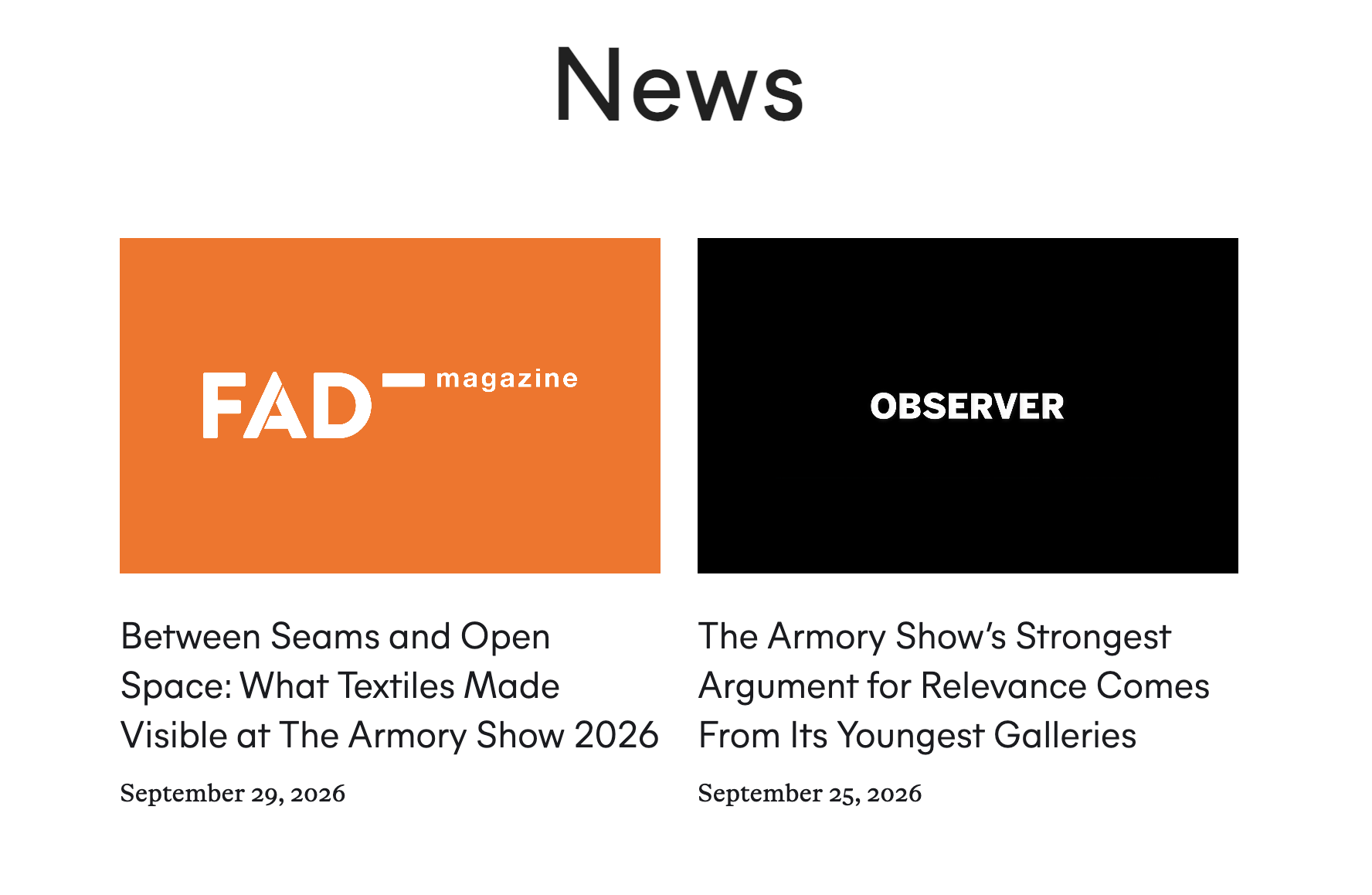
A dedicated CMS collection for news and exhibitions lets the gallery announce new shows and updates on its own, without needing ongoing design support.
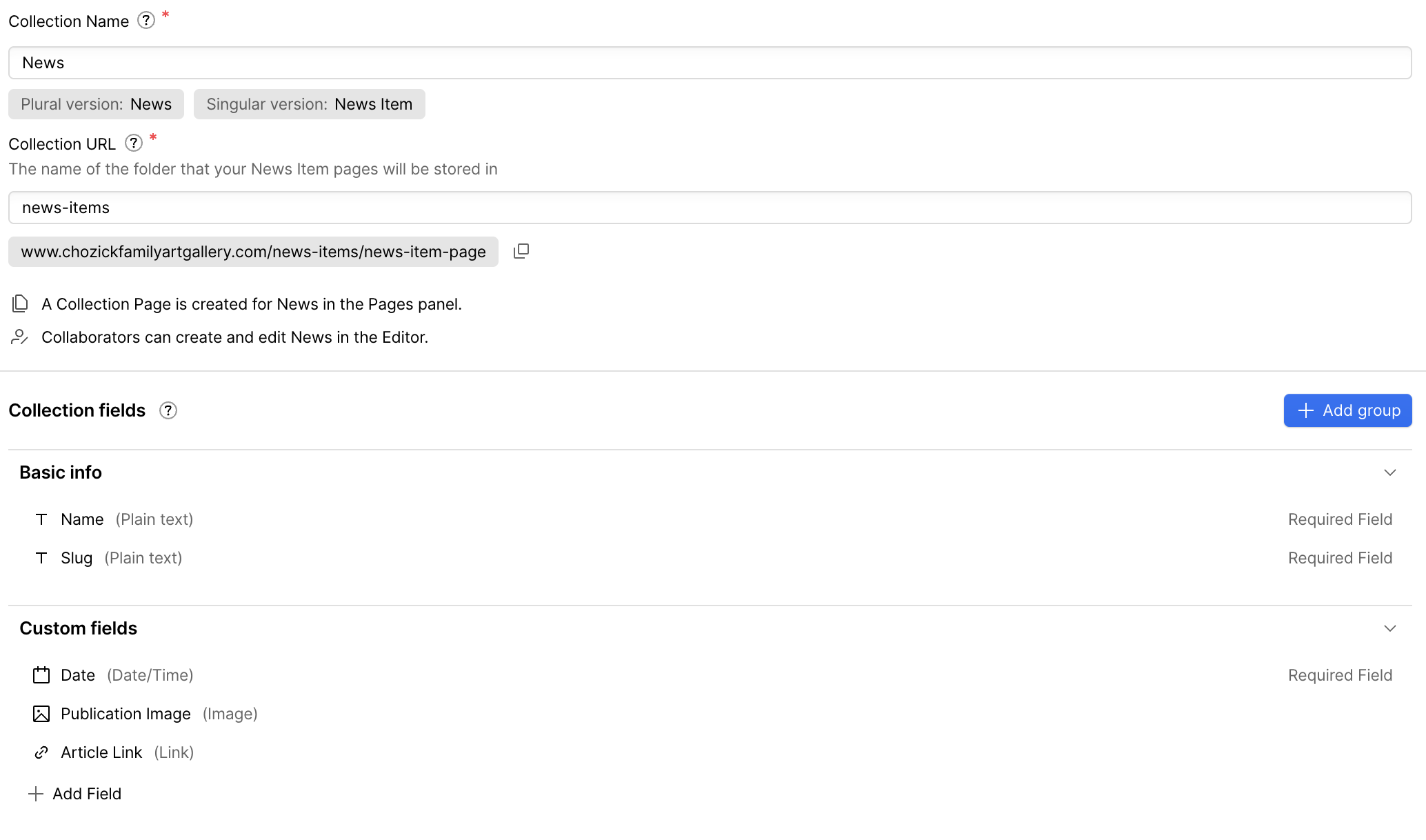
Building a gallery's entire digital presence from the ground up meant every decision, from IA and visual identity to CMS architecture, had to hold up under constant change. Seeing the site live, ranking well organically, and hearing that both the gallery and its artists are genuinely happy with it has been one of the most rewarding parts of this project. The biggest lesson was that a CMS is only as scalable as the people using it. I built every collection so the gallery could publish on its own, although I still handle most updates because at this point it is very light work and fun to be involved. Next time I'd design the editing experience as deliberately as the public site, with clearer field names and help text, image size guidance and a short handoff guide, so the team can fully own their content.
